Spotify Wrapped, what it takes to grab the world’s attention
UX design at its best
Spotify Wrapped is one of the world’s most widely shared marketing campaigns. It’s a masterclass in user journeys, data visualisations, design and sharability.
For anyone that doesn’t know, Spotify has a yearly campaign called Wrapped, which gives listeners a personalised breakdown of what they’ve been listening to and exactly how long. This data visualisation experiment started in 2013, with a webpage called “Year in Review”. In 2016 this became the more personalised Wrapped campaign, delivered to each user at the end of every year.
Design
Wrapped is Spotify’s biggest yearly design project and each year it takes on a different visual identity, telling the user their music and audio story of the year gone by. Interestingly, Spotify aspires to create a new articulation of the brand each year. This is a great example of how to execute a fluid and fresh creative direction, keeping things fun and current, whilst delivering your bread and butter.
The design is based on a series of interlocking and overlapping shapes, each designed within a 16x16 grid. The shapes feature square, spiky and soft edges, and a spectrum of colours, representing the world’s diverse listening habits.
World-class UX
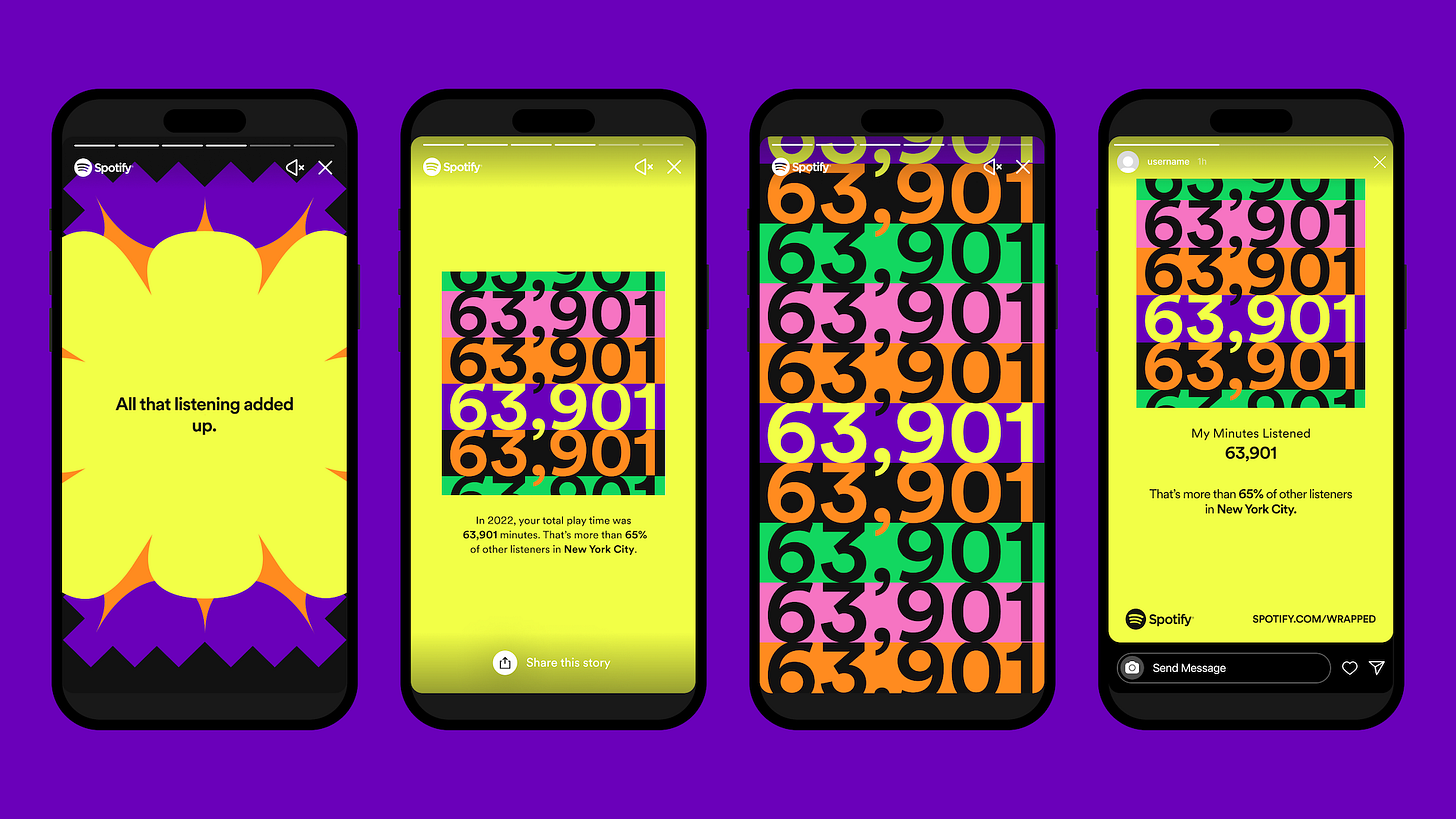
At a time when companies are treading carefully with user data, Spotify presents your listening habits back to you, encouraging you to gaze into your vibrant audio kaleidoscope and show it off. Your listening stats are framed against others, giving you context and a connection to a world of listeners.
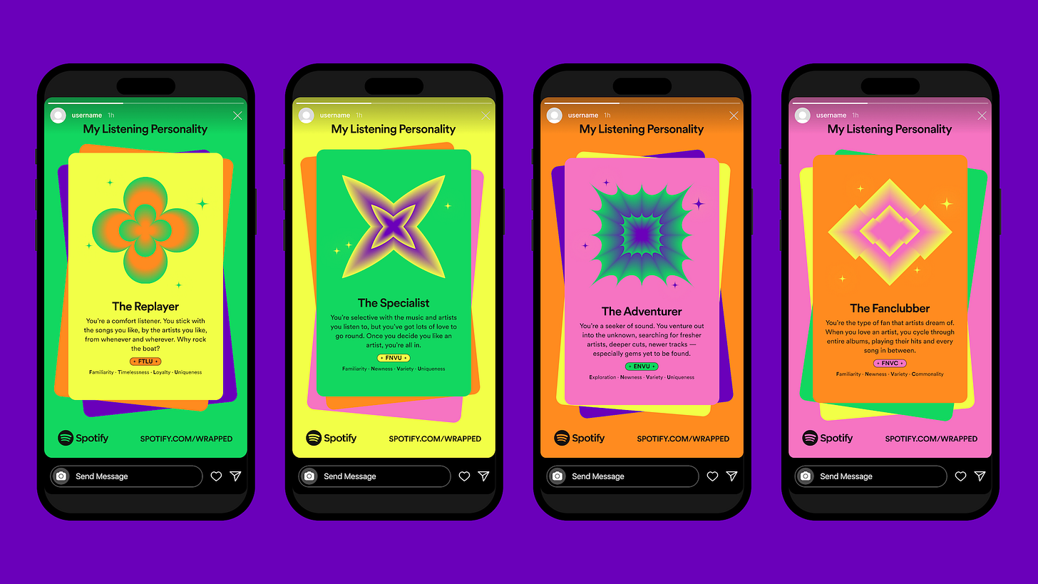
You’re assigned a personality type based along with a positive affirmation. Finding out what your music listening personality says about you is fascinating and engaging.
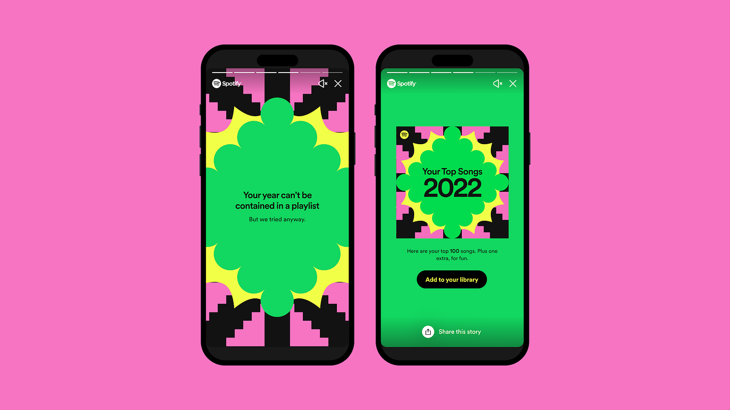
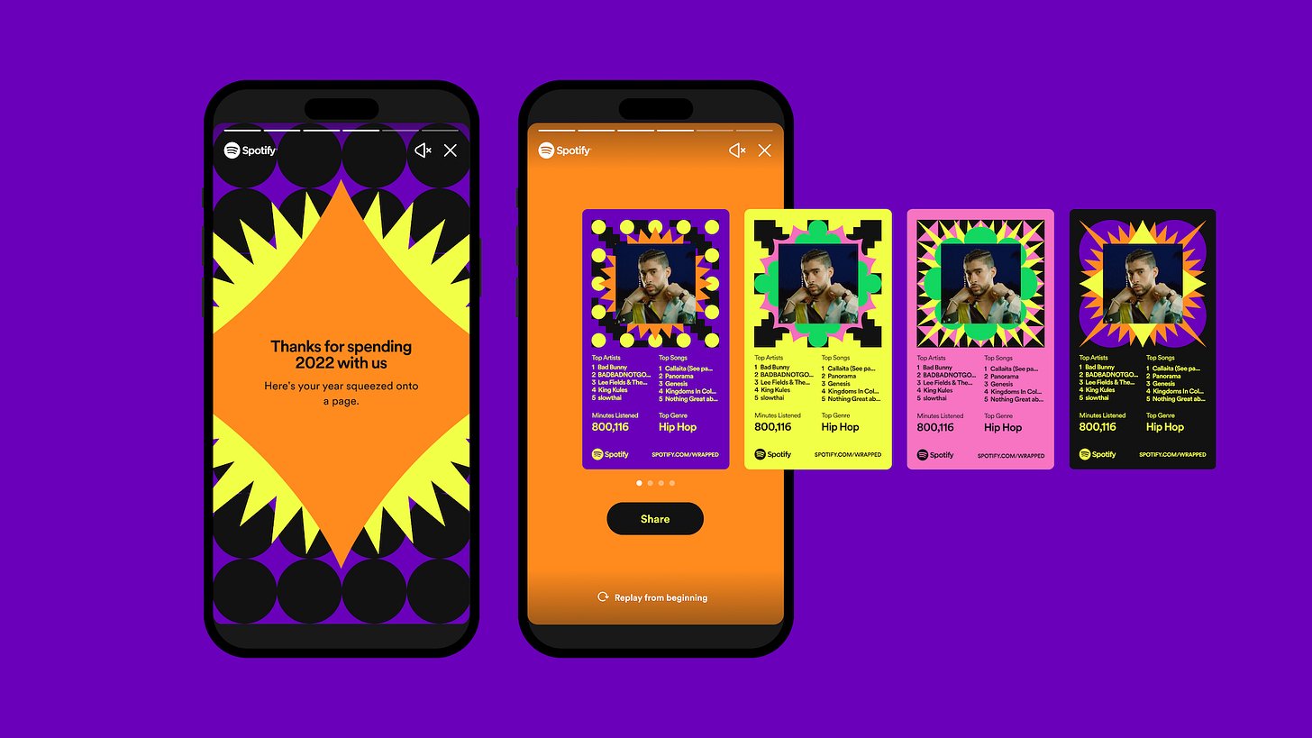
Finally, you’re given a roundup of your favourite artists, songs and some personalised stats for example if you’re in the top percentile of listeners for a particular artist.
The content is presented on Instagram Story like cards, with motion design bringing each to life, guiding you through statistics with playful interactivity. The colours and shapes are striking but bring consistency across the journey with no compromise on accessibility.
Shareability
It’s the shareability that makes wrapped such an effective campaign each year, sparking conversation with many users proudly sharing on their socials. Developing a product that speaks to people personally, making their data a joy to digest and share is the lesson here. It’s a lesson that’s centred around each listener and executed at scale.


